A few small, easy changes can make your cleaning company’s website much more powerful.
It’s no secret that the world runs on the internet these days. And as website builders get more and more clever, it’s easy to be intimidated by all the options. There are so many SEO and AI tools, clever hacks, and back-end changes to consider! Unless you’re a web designer by trade, you might get overwhelmed.
Today, we’re boiling down three simple changes you can make to your website to get more clicks and more customers.
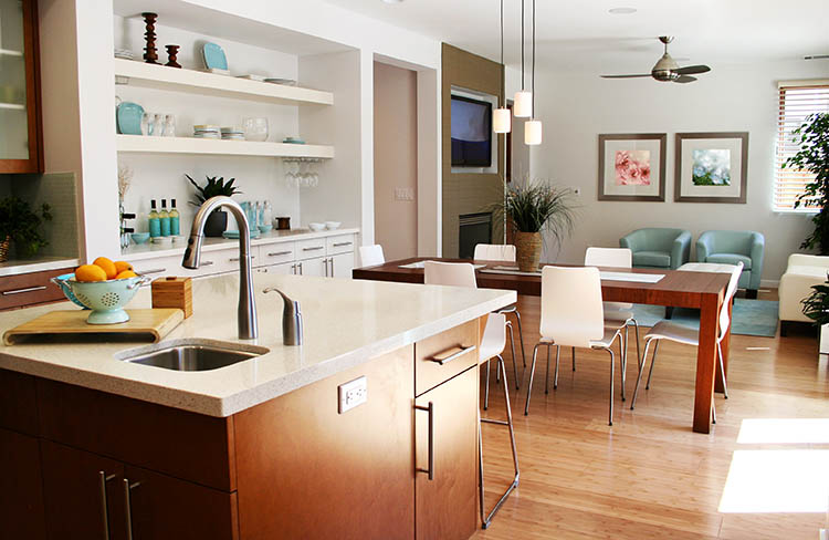
Don’t use pictures of people cleaning a home. Use pictures of happy people in clean homes.
It’s time to get a little philosophical.
House cleaning is a service. And technically, people are buying a service when they hire you. But they’re hiring that service because they want a specific outcome: a clean house.
They’re not paying for the experience of watching someone clean their house. They want that magic moment when everything looks and smells fresh and clean.
So, from that perspective, you’re really selling an outcome clean home.
Your best strategy, then, is to put pictures of your product on your website. Don’t use pictures of people cleaning; that’s just the means to the end. Choose pictures of clean, beautiful homes and people looking relaxed and happy in those serene spaces.
This is a subtle way to give your customers a preview of the benefit of your service. It’s a simple but powerful marketing tactic: “Book with us, and you’ll get this.”
Put the call-to-action (CTA) button right at the top of the page.
You may be surprised to learn how easily people can be deterred by scrolling. Many web users are unwilling to look very far for what they want. So if you bury it at the bottom of your page, you might be disappointed with low click-through numbers.
Thankfully, the solution is easy: Put your CTA button at the top of your page. Make it painfully easy for people to find what they want.
A few other tips:
- Make sure it looks “clickable.” If you try to be too clever or slick, people may not realize it’s a button. It’s okay to use a classic button graphic and a bright color, so long as it matches your overall color scheme.
- Don’t be afraid to move it around. Experiment with a button in the header menu or right under your first headline. Track the results and decide based on numbers.
Want to learn more about where to put your CTA? Check out #2 at this link >
Don’t put your phone number right next to your “book a cleaning” button.
This may seem counterintuitive. After all, why wouldn’t you put two contact options next to each other?
Here’s why: Your phone number dilutes the power of your “schedule a cleaning” button. People may be confused whether they should call you or click the button, and many may call you instead. If you’re working to streamline your operations and gather all bookings via that button, this can muddle your systems. Your “book now” button should stand on its own so people know exactly what to do.
But you need your phone number somewhere, right? Put it in your footer and on your “contact us” page. If people specifically want to call you, they can find it easily in those places.
–
Of course, website optimization is an ongoing process. There are endless strategies and hacks for making your website as powerful as possible. But getting started with these three easy hacks can make a noticeable difference.
Let us know in the comments if you’d like more posts about website tweaks—and what you’d like to learn.